Shape Up! Devlog no.1


Shape Up!
Devlog no.1 - The postmortem
The Preamble
This is my first game jam, and it was a tonne of fun. I went into this with the goal of doing my best and seeing how far I could go. It's been a while since I last made a game and even longer since I finished a game, so there was lots to relearn.
I'm a programmer at heart, so this was my forte going in but also where I had to relearn a lot, going with Unity and desktop application was a natural choice, I've made games with it before so it'd be the best to get me back into it.
Art and modelling was, to say the least, something I'd never done, animation included, so this was by far something I had to make sure didn't hold me back, but also didn't take too much time. But none the less lets get into this postmortem.
The Boss Rush Jam
As I said in the opening, this was my first game jam, I've always avoided them for some reason or another, but a boss rush was something I've been interested in making. I attempted to make a 2D boss rush a couple years ago, but time and motivation got away from, I did comeback and clean it up, but it was only ever one boss and something I'd wanted to improve on.
The Theme/Mechanics
Exchange is a cool theme, there's so much you can do with it. I had to keep in my scope, while there's a lot of ideas you can make, this was essentially a solo project and I had many areas I needed to improve on. I needed to keep the idea simple, ultimately landing on an exchange of energy, the player gets slower as the boss drains their energy, while the player can absorb the bosses attacks to regain energy. It's risk and reward, and simple, so to added a little complexity I added the idea of states that the boss and player are boss able to switch to. To absorb an attack the player has to match the state of the bosses attack.
What didn't work?
The state switching idea was a lot more core to my original attempt at matching the theme, I had different states affect stats such as damage, healing and movement speed, with the intent of only damaging the boss while being in the same state. This would mean you exchange these stats each time you switch. This alone wasn't bad, but after play testing this original idea, the player having higher movement speed in 1 state, made it significantly more fun to play in, with more damage being second and healing being avoided. Another key reason for changing from this was the time it'd take to balance this with other mechanics to make it work, I had a 3 week deadline when I started the game jam, so I had to make a decision to go with something simpler so I could stay on track. Obviously forcing the player to match the bosses state to damage or absorb their attacks didn't feel greater when you go from zooming about to being a snail, I need to make a change.
What worked?
As mentioned a change was needed, simplifying the mechanic and leaning into the parts that felt fun. This is where the energy mechanic was tied to movement speed and damage. Essentially as the player absorbs the bosses attacks they can maintain a good DPS and feel for the character, if they choose not to risk the absorbing, the player is left with a slow and weak character, making the boss fight drag on, thus incentivizing the player to take the risks to keep their energy bar up. It's less obvious as to the theme of exchange, but it makes the game feel and player way more smoothly.
The state switching mechanic being simplified to just absorbing the bosses attacks made helped break up the monotony of gameplay and give the player something more to do, it's a fine line of balancing challenge and overwhelm. The bosses used to change state every attack, this was quite overwhelming with later bosses, it's now on a timer!
The Art
Simple was key, I've never modeled, rigged or made any art for a game before, so going into this I had two choices; either use assets or do it myself. I chose to do it myself for both a challenge, but it also let me more finely control the final package. I ultimately went with simplified geometric shapes for my bosses and characters, I knew they would be easier to model and animate than a fully rigged or modeled humanoid character. So I based the boss design and the colour scheme around this idea, and idea of threes and simplicity.
What went wrong?
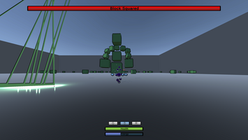
As I said above, I've never modeled, rigged or animated before, so my bright eyed, optimistic self, decided now was the time to learn all of those. You can see this in Boss 1, Block Squared, it's got a rig and it uses it, not very well though, it's jank beyond belief and took too much time and effort, some attacks look good and some were scrapped because they did not work nicely in unity. The main issues with this was making it clean and animating it how I wanted to, which was too great of a time sink for me to get better at during this jam, so I scrapped rigging entirely for the next two bosses.
Lets not talk about the lack of environment art, that was way too much for me.
Now you would think my life was less stressful having removed rigging, but what I lost in rigging troubles I gained in animation troubles and it all comes down to blender and my lack of knowledge. Here's the thing, when you don't have a rig and you create an animation for a series of objects, blender saves these separately as different actions based on the object, rather than the collection of objects like it does when you just use the armature. This meant when I would import it into Unity, every object that made up a boss had it's own animation, this was a nightmare and I couldn't figure out how to combine these, I searched up a lot but couldn't figure out a good solution. There was 1 small hack, where if I imported the blender file into Unity, rather than the fbx file, it's keep all the open animations as 1 file, so I could use that, which is what I did for the player characters idle animation, but this proved to have other issues and was time consuming, so I dropped this and about animating in Unity.
What worked?
Animating in Unity, if you have a complex rigging system, is a bad idea, but here I just have some shapes and performing some basic rotations and transform adjustments was a piece of cake, and they looked good too! It's about as time consuming as animating in blender for me without the headaches with importing. So I decided to do with the next two bosses, and I think they came out really well!
Overall animating was actually something I enjoyed a lot and didn't struggle with much, a real wonder, but once I changed to this work flow ideas just manifested themselves and most turned out pretty good!
The Audio
Not much to say on this one, my friend put together a few tracks in his spare time based off what I gave him in the design brief. It all turned out great, I wish he had the time to do more!
Sound Effects were done by me or obtained online, all the voices were done by me with some audacity magic, it was a fun addition to the bosses and really makes them pop and feel more personable!
The Programming
This one is a mess of things, it's great but flaunt with some many strengths and weaknesses. I'm strongest here, but also too much of a perfectionist, in the past, this has caused me to give up on projects because of wasting time of small things. Here was not much different, but I managed to make it through, unfortunately there's so much I could talk about it'd need it's own post, so if anyone reads this and would like to see that let me know! I'll just touch the basics here.
What went wrong?
Bugs, bugs and more bugs, every developer knows it and it's completely unavoidable. One early bug that caused great annoyance, was the movement for the first boss, it was cause the boss to sink into the ground slowly and was quite annoying, I didn't fix this till a few days before submission because it was really annoying and I just disabled movement for the boss. This is also why both the second and third bosses are stationary!
State management, this, this is a seriously annoying problem for me, you think you've defined classes well enough that they can be extensible and then bam new problems, new issues to pass new bugs! I won't go too deep but I just had to give up on trying to not make it bad, it works and every character has way too many components on them.
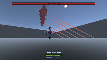
Lasers are a core mechanic used by all three bosses, but I kept implementing them in different ways rather than a single unified way and this, at one point led to having four different scripts all doing pretty much the same thing, with minor differences, again something i'd like to fix.
There is so much more I could talk about, especially UI navigation troubles, but this is already a long post.
What worked?
Well the game runs! Yay! Some of my code I re-adapted from long dead failed projects, such as the camera! It worked great, baring a bug when you unlock-on. There's not a lot to say here, that again wouldn't need it's own post, everything has a draw back and while many things work well, they lack a lot too, that's programming for you.
Movement for the player and state switching for them work really nicely, along with absorb and the whole flow of working with the player character, nothing really changed from my vision so I was super happy.
Conclusion
If you've read this far, I thank you. This was a really exciting and fun experience that caused some much stress and joy, I love making games and it's great to see all the other ideas people have come up with and made. I'd do it again, maybe after a small break though!
If I had a takeaway, it'd be to focus on the simple, scope is so important, whether you're in a team or not, it makes and breaks projects and planning ahead of time helps so much!
I wanted to thank the team that helped organize the game jam, it was great! I'm looking forward to joining again next year!
The End.
Files
Get Shape Up!
Shape Up!
A small boss rush game, where you stop shapes from stealing your energy.
Leave a comment
Log in with itch.io to leave a comment.